Case study
Pallas
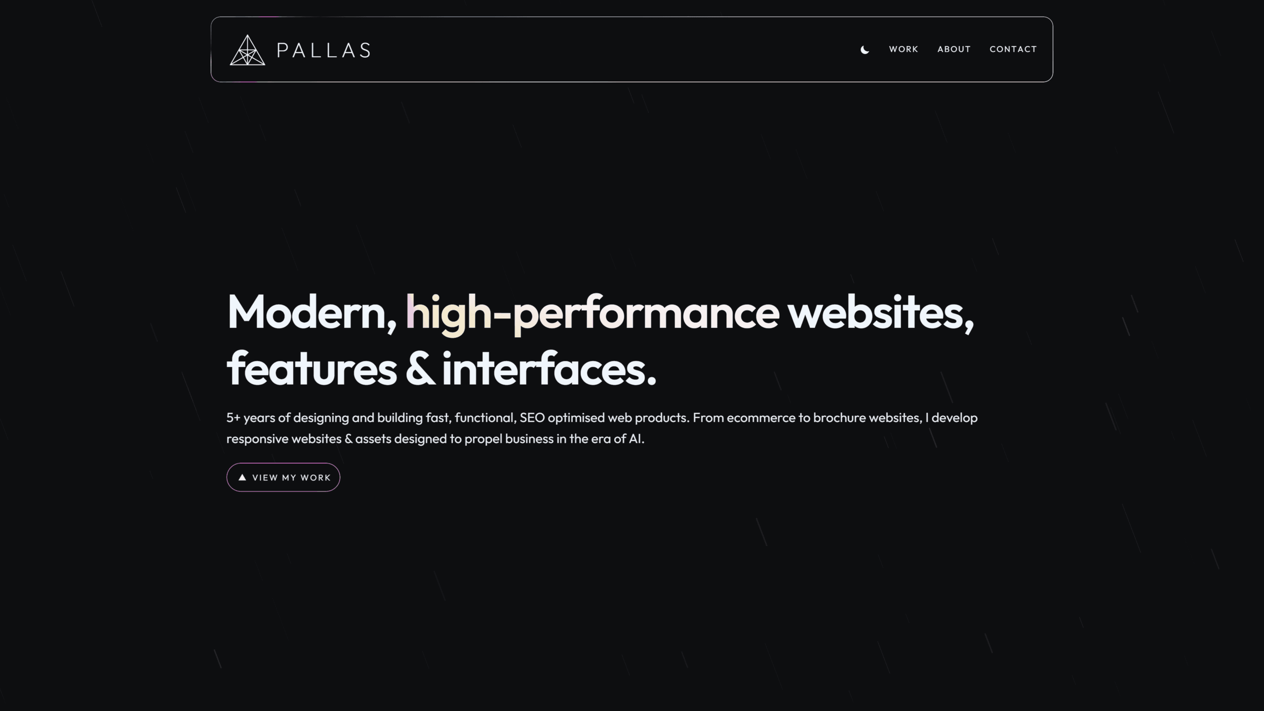
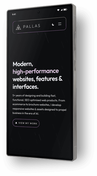
A portfolio site made to show people what I do, my skills and my work.
Previously I could only show live examples of projects I built, but now I can display them on a visual, interactive project. I have always found technology easiest to learn during real use cases, so I built pallas.cloud to learn new tools on the fly.
- Headless build
- Design system
- WebGL
- Motion
- Performance
- Modern tools
- SEO
01 / The brief
A portfolio with nowhere to hide
A portfolio is a poor place to fake a set of skills. The site had to be something I would send to a client, an employer, friends, family and be something I could update with new ideas whenever I wanted. I wrote about that decision in why I push to learn new technology.
Pallas is built on headless WordPress, with a Next.js frontend hosted on Vercel, served through Cloudflare. WordPress stays where it's useful: pages, posts and media. The public site is a Next.js app that asks the CMS for content and renders it. This keeps content editable and the front end open to the best next.js has to offer: lightweight, responsive, and modern performance & styling improvements.
02 / Architecture
Two halves and the connection between them
Most content is pulled from WordPress where HTML is sanitised, upload URLs are rewritten & optimised, and the menu has a fallback if the CMS loses connection.
Published edits are automatically revalidated within 60 seconds. This allows me to update the site without logging into SFTP.
Utilising content from the CMS means changing a paragraph in WordPress does not mean rebuilding the design. However some case studies that need a designed layout, like this one, live in the Next.js app.
- WriteWordPress
- Pages and posts
- Media uploads
- Menus
- Site settings
- GraphQL
- RenderNext.js
- Page layouts
- Design
- Performance
- Components
- GitHub
- ServeVercel
- Preview on every push
- Revisions & reviews
- Hosted & packaged
- Cache & revalidate
Cloudflare
03 / Introduction
Handing the logo to the navigation
The first view is the logo in the center of the screen, moving to the island navbar, revealing the site name "Pallas". This is designed to draw the eye to the top left of the screen and get users familiar with the branding before the content is revealed.
Animation is handled by GSAP measuring the end navbar logo location (it's possible for the user to refresh partly-scrolled, meaning it could be docked) and moves the intro logo to it. While this starts when components are ready, each step is on a set delay, so it never falls out of time. Reduced motion skips the sequence. Without JavaScript, a style rule hides the overlay, and the page is just the site.
04 / Design
A design system the whole site follows
Many effects and styles were written and then removed. I started with simple ideas, created them, and if they didn't fit the style I wanted, they were dropped. Colours were the same idea: I wanted to be able to refer to the theme as "black pearlescence", so I created a design system that followed it.
A dark base with no light backgrounds. Bright shimmering outlines and accents. White text with two heading styles for consistency and to draw the eye to things that matter. I had to ensure the pearlescence wasn't overused, so after every section was built, I had to make a choice on whether it was too much.
I also wanted every pearl feature on the site to focus on the navbar logo, giving the impression of a prism casting light on the page. This was a huge challenge to implement with several bugs along the way.
Variables
The first hex is dark mode and the second is light mode. They invert between the two themes.
Secondary accents
05 / Accents
The backgrounds of Pallas
Rain
The homepage opens on fine coloured streaks, angled at 60 degrees to match the triangle logo. They are drawn on a canvas behind the content and they hold still when reduced motion is on.
Topography
Contour lines signify the portfolio and work area of the site. WebGL is used to create a completely random pattern on every refresh.
Dots
The about page and quote sections have a grid of soft dots, with a few randomly selected to shine in the same iridescent colours as the theme.
Gradient
A pearlescent wash gathers in the bottom right of the contact blocks. The colours drift, then fade into the page, so the writing on the left remains clear.
06 / Under the surface
The parts nobody sees
- 01
Contact forms
Built with Next.js server actions and enabled with Resend, contact forms keep spam out of the inbox and make a simple hello easier.
- 02
Performance
All pages are constantly performance-reviewed and optimised for FCP, LCP, and TTFB, without compromising on accessibility or user experience.
- 03
Accessibility
Every element is built with accessibility in mind. Buttons have correct focus states, and content has appropriate aria labels. The site is keyboard-navigable.
- 04
SEO/AEO
Each page and the site as a whole are built with a consistent SEO/AEO strategy, targeting web development, but not appearing as an agency.
- 05
Strict testing
Every change is tested during development for speed, visibility, devices, browsers and edge cases. It's then reviewed as a whole after each live deployment.
- 06
Discarded revisions
Even if something worked initially, further development of the site often reveals improvements and consistency. The original elements are updated to suit, or removed.
07 / The memory bug
Tracing a 4.6GB memory leak
The primary concept for Pallas was to have every pearlescent accent to focus on the navbar logo. I had never seen it done before, so I had to figure it out as I went.
After completing the initial homepage build with the bulk of the animations & effects applied, the homepage render memory climbed from 140MB to over 4GB in 60 seconds. This visibly slowed the page. The heap lingered and continued to climb until the device ran out of memory.
Roughly 1,700 variables were inheriting a custom property for the pearlescent effect that forced style recalculation on every frame. Old calculations didn't get discarded properly, and continued to grow unchecked.
Several fixes were applied, only measuring when necessary, deferring the calculation until it's needed, and resetting the variable when it's no longer needed. Commit 253e7cf on 8 October stopped the climb. Idle memory now holds around 160-200MB. The main thread is busy about 34% of the time instead of 99%, and style work is about 20% of idle time instead of 80%. The problem was solved and no longer grows.
Browser memory when idle
253e7cf253e7cf it stays between 160 and 200MB.- Idle render memory
- 0-0MB
4.6GB within 70s - Main thread busy at idle
- 0%
99% - Idle time spent restyling
- 0%
80%
08 / Performance
Pagespeed Insights
- 0Performance
- 0Accessibility
- 0Best Practices
- 0SEO
- 0/2Agentic Browsing
- 0Performance
- 0Accessibility
- 0Best Practices
- 0SEO
- 0/2Agentic Browsing
09 / Process
Project timeline
Because the purpose of this site was to learn and develop new skills, I did not plan the whole site out from the beginning. I built it commit by commit, a section at a time, Reviewing what was possible, reading up on new technologies, and building the site as I went - keeping what looked best.
- 10 to 12 Sep
Foundations
The app shell, the CMS, and the first deploy.
- 13 Sep to 5 Oct
The homepage
The intro, the docked logo, and the visual rules the rest of the site had to follow.
- 6 to 8 Oct
Structure and the leak
Content, contact, and the fix to the CSS memory leak.
- 9 Oct to Nov and beyond
Pages and proof
Work, about, news, and this case study. Work will continue to be added as I have new ideas or projects to share.
10 / By the numbers
What the build added up to
- Next.js
- React
- GraphQL
- WordPress
- Tailwind
- SCSS
- Vercel
- GitHub
- TypeScript
- GSAP
- Lenis
- Cloudflare
- Resend
- Lucide
- ShadCN/Radix
11 / Outcome
Conclusion
Pallas is the proof. It is the stack I wanted to learn and use. And is a personal testbed for new ideas and concepts I want to bring to my daily work.
This site is and forever will be a work in progress. I will continue to add new pages, features and improvements as long as I have new ideas or projects to share.
If you've spotted any bugs, anything that can be improved, or have ideas for new features, I'd love to hear from you.
Contact
If you're interested in learning more about me and what I do, or to discuss a project, email is the fastest way.
Typical response within 1 working day.